A bond index fund’s tracking error is governed less by how many securities it holds than by what the index is made of: whether its weight concentrates in a core a sample can grab, and whether its composition offers a factor structure a sample can exploit. Trackability is a question of composition, not size; cost decides how much of the index is worth holding.
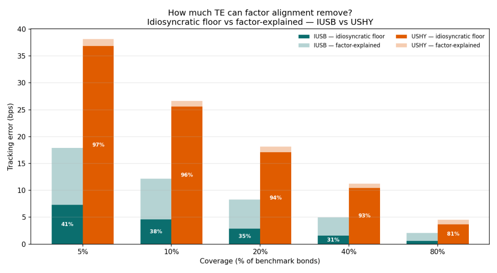
In a broad, sector-structured market most of that tracking error can be aligned away through factor exposures, sector above all, whereas in high yield 93–97% of it is an irreducible idiosyncratic floor beyond the reach of any factor alignment.
BlackRock’s own funds bear this out. On annual tracking difference the high-yield ETF misses its index nearly twice as widely as the broad-market fund, and in 2025 it closed at a premium to net asset value on 222 of 250 trading days. A persistent premium is what you’d expect from a wrapper manufacturing daily liquidity out of a market that has little of its own.
The wrong intuition
Ask which is harder to replicate by holding only a fraction of its bonds – a high-yield fund of around 1,900 bonds, or a broad-market fund of around 18,000 – and the obvious answer, that the bigger and more sprawling portfolio is more difficult to track, would be wrong! On a fractional basis, the high-yield index is the harder one to replicate. The size of the stack turns out to be a poor guide to how hard it is to match. What matters is what it’s made of.
The intuition to equate more holdings with more difficulty is understandable, because that’s how equity indexing works: most stock index funds hold every constituent at its market weight, and full replication is cheap because equities trade continuously on exchanges and even broad indices run to a few thousand names at most. Bonds break both assumptions — a single issuer can have dozens of bonds outstanding, each with its own coupon and maturity, and the broadest indices run well into five figures, most of them trading infrequently and over the counter rather than on an exchange.
This creates an expectation that a bond portfolio that samples its benchmark rather than fully replicating it must track loosely. The iShares Core Universal USD Bond ETF (IUSB) holds almost 18,000 bonds as of 30 June 2026, and owning only a fraction of them sounds like it should leak tracking error with every bond ignored. Understanding why that expectation is sometimes wrong is the job of this post.
Vanguard put a clean frame on the answer in its research note, “A bond index fund’s balancing act: Tracking error and cost.” Successful bond index management, they argue, is a balance: align a portfolio’s key risk exposures – duration, credit quality, sector – to hold down tracking error, while minimising the transaction cost of getting there. Replicate the index perfectly and you accumulate costs in the illiquid corners of the market; ignore the risk exposures and tracking error blows up. The skill is finding the point where a subset of bonds carries a risk profile like the index even though its composition doesn’t.
That reframing is useful, but it leaves a deeper question open: why does the balance sit where it does, and does it sit in the same place for every index? I argue that it doesn’t. The trade-off between tracking error and cost is the visible price of a specific job the fund performs: turning an illiquid, OTC market into a single security that trades every second of the day. The harder that liquidity transformation, the more binding the balance. Two funds that I analyse sit near opposite ends of that spectrum: IUSB, the broad USD bond market anchored by a deep, liquid core of government and securitised paper, and USHY (the iShares Broad USD High Yield Corporate Bond ETF), the high-yield corner of that same universe. The balancing act is far tougher in the second case – it’s really a liquidity act, and the ETF wrapper is the machine that performs it.
How tightly can a sample portfolio track a benchmark?
I use a simple test to answer this question. I take a benchmark’s full holdings at month-end and build a smaller portfolio from some fraction of its bonds – 5%, 10%, and so on up to 100% – and measure how closely that sample’s return tracks the benchmark’s over the following month. I employ two methods to sample bonds. The naive way picks bonds at random and weights them by size. The risk-aligned way picks bonds so the sample’s duration, credit quality and sector mix match the benchmark’s, then weights them to keep those exposures in line. I repeat each a few hundred times at every coverage level, pool across a run of monthly windows, and record the median tracking error: the standard deviation of the sample’s return against the benchmark. Alongside this, I estimate the round-trip cost of constructing each portfolio, since tighter tracking comes at the price of buying more bonds.
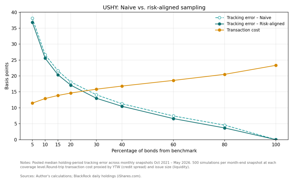
Two things stand out. First, tracking error falls as you hold more bonds – from about 37 basis points at 5% coverage down to zero at full replication. No surprise there. Second, and more telling, the two sampling methods barely differ: the risk-aligned line sits only slightly below the naive one at every point. Aligning duration, credit and sector buys you almost nothing that holding a handful more random bonds wouldn’t. Meanwhile the cost line climbs steadily, from around 11 to 23 basis points, and crosses the tracking-error line at roughly a quarter of the index.
Now run the same experiment on the broad market.
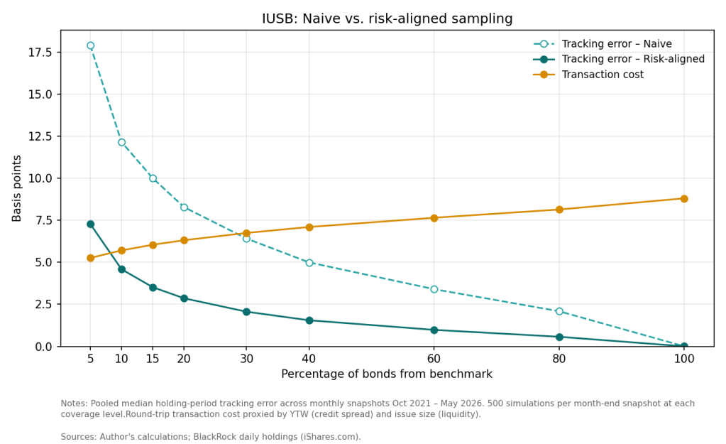
Curve shapes are similar but the numbers paint a different picture. Tracking error starts far lower – about 7 basis points for a risk-aligned 5% sample against roughly 18 for a naive one – and collapses toward zero much faster. Here risk alignment is decisive: the gap between the two methods is wide, a factor of about two and a half at low coverage, and it persists across most of the curve. Cost is lower too, barely rising from 5 to 9 basis points, and the risk-aligned tracking-error line drops beneath it by the time you hold a tenth of the index.
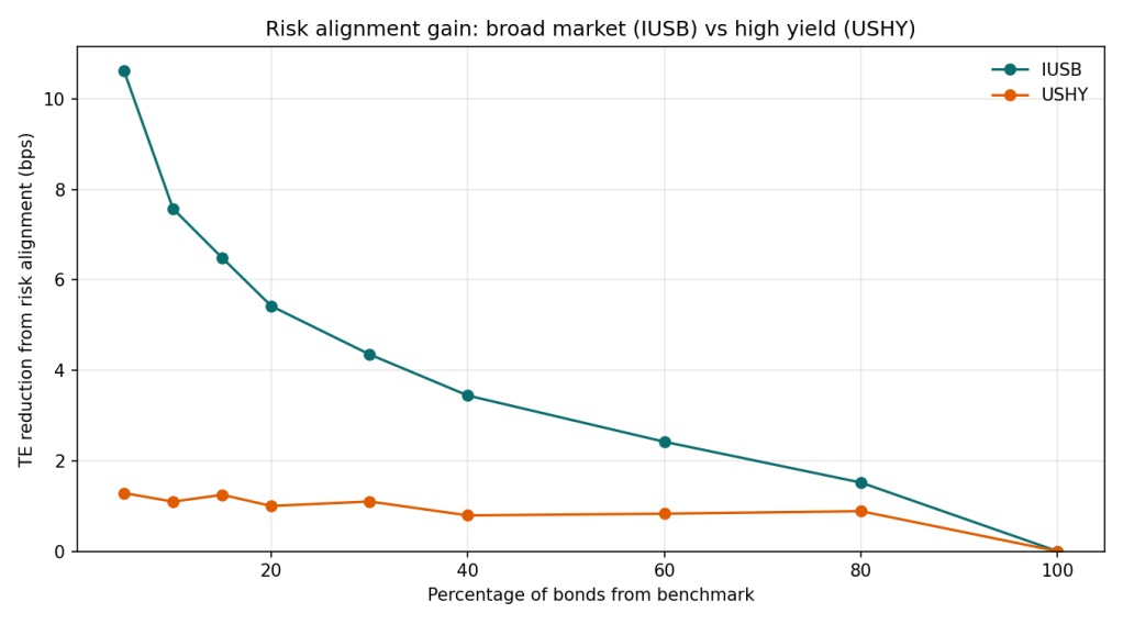
These figures together answer the opening question. The HY benchmark is harder to track and the optimisation barely helps. The broad benchmark is easier and cheaper to track and risk alignment helps enormously. The next two sections take that apart: first which risk factors are actually doing the work, then why the two funds sit so far apart.
Which factor is doing the work?
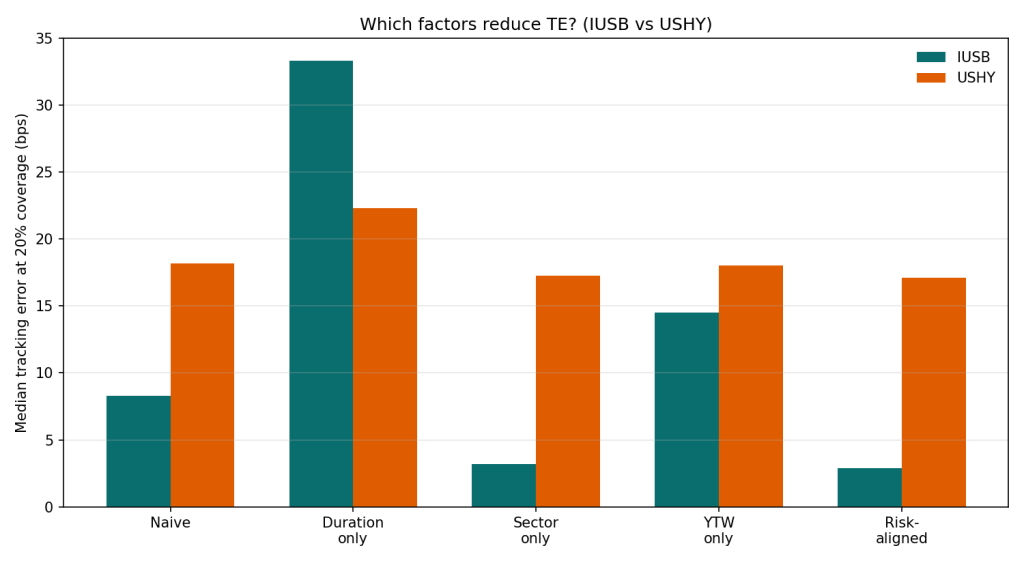
The risk-aligned portfolio matches three things at once: duration, sector and yield-to-worst (a proxy for credit and spread risk). I broke them apart to see how much of the improvement each delivers by itself. Next figure shows the median tracking error at 20% coverage for every variant, side by side for the two funds.
For the broad market the answer is sector. Matching sector alone drags IUSB’s tracking error from about 8 basis points to 3, essentially the whole way to full alignment. Get the mix of Treasuries, mortgages and credit right and the rest is rounding. The other two factors backfire: duration alone pushes the error above 30 basis points, yield alone to around 15. Chase a single non-sector target and the sample loads up on whatever bonds hit it, throwing it off the sector balance that actually drives returns. The deeper reason is compositional: IUSB’s risk is systematic and sector-shaped – rate-driven Treasuries and mortgages alongside spread-driven credit – so the sector mix is the exposure that matters, and duration rides along inside it. The next section puts a number on how much of each fund’s risk that structure explains.
High yield tells the opposite story: nothing works. Every variant, full alignment included, sits in the same 17-to-22 basis-point band as the naive sample. There is no factor to exploit: a high-yield bond’s return is mostly its own issuer’s story, which no amount of matching diversifies away. Only holding more names does, which is why USHY’s error stayed stubbornly high however cleverly it was sampled.
A liquid core and a long tail
So far we have established two facts: high yield tracks worse at every coverage level, and risk-aligned optimisation doesn’t help it. Next figure puts numbers on the second point. It splits the tracking error of a naive sample into the part factor alignment can remove and the part that survives even a perfectly aligned sample: the idiosyncratic floor.
For the broad market, alignment does most of the work: only about a third of IUSB’s tracking error is floor (31–41% at coverages up to 40%), so aligning duration, sector and credit strips out the other two-thirds. For high yield the picture inverts: 93–97% of USHY’s tracking error is floor at any coverage a sampled fund would run, and even at 80% of the index the floor is still four-fifths of the error.
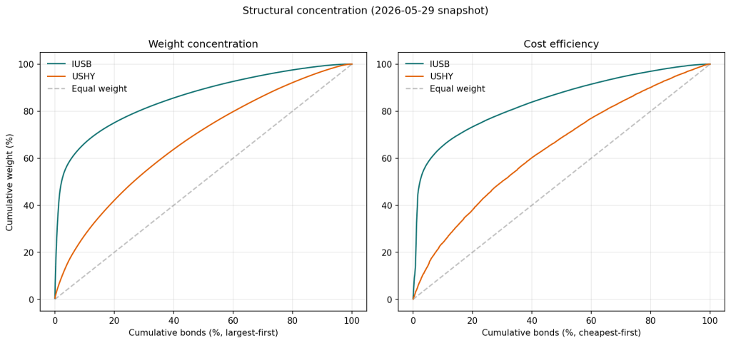
Why is USHY’s tracking error overwhelmingly idiosyncratic? That is a question about structure. Figure below plots each index as a composition curve: bonds ranked and accumulated along the horizontal axis, the cumulative share of index weight up the vertical. The diagonal is perfect equal-weighting; the further a curve bows above it, the more concentrated the index.
The left panel shows the primary composition difference. IUSB has a liquid core: its largest 2% of bonds carry almost half the benchmark’s weight, the top fifth three-quarters, so a sample that grabs those big, liquid names has most of the index. USHY’s curve is closer to the diagonal, and it takes half its bonds to reach 70% of the weight. There is no core to align with; the risk is spread across hundreds of issuers, so a small sample always misses a scattered chunk.
The right panel tells a similar story about cost. Three-quarters of IUSB’s weight sits in the cheapest fifth to trade, so you can build most of the exposure without touching an expensive bond. USHY’s weight spreads across the whole cost spectrum, with the cheapest fifth holding only about a third, so benchmark exposure means buying pricier, less liquid bonds.
This is the liquidity transformation in two curves: IUSB is a small, liquid core with a long thin tail, USHY is all tail. Hold IUSB’s core and you’re most of the way to the match, cheaply; high yield offers no such shortcut. That is why the balancing act, gentle for the broad market, turns brutal in high yield, and why an index with a tenth the bonds is the harder one to replicate.
The real funds and the price of liquidity
So how many bonds does a fund actually need? For the broad market, surprisingly few: a risk-aligned tenth of the index tracks more tightly than it costs to build, because the liquid core carries the load. For high yield there is no comfortable number. Error falls only with coverage, cost rises with it, and the two cross near a quarter of the index; beyond that, precision is bought at a loss.
BlackRock’s own numbers point the same way. Over 2021–2025, USHY’s realised tracking difference — the average absolute gap between the fund’s annual return and its index, a level rather than the volatility the simulations measure — ran to 15.6 basis points a year against 8.6 for IUSB: the high-yield fund tracks nearly twice as loosely, the same ordering the simulations imply. A couple of basis points can be explained by the higher expense, but the deviations move both ways, so most of it is tracking, not cost. The premium/discount data hints at the flip side. In 2025 USHY closed above NAV on 222 of 250 days and below it on just 26, versus 192 and 43 for IUSB, and with wider premiums. Part of any bond ETF’s premium is mechanical but the rest is what you’d expect when a wrapper supplies liquidity its underlying market lacks: investors pay extra for an escape from the balancing act itself.
Starting yields predict Treasury returns, most tightly when your holding period is close to the maturity.
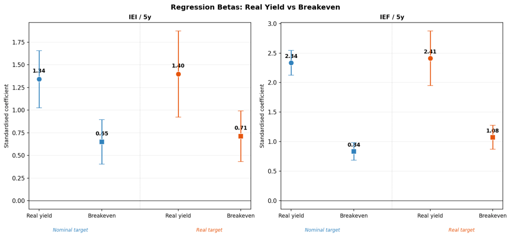
Split the yield into a real yield and expected inflation, and it’s the real part that does the predicting.
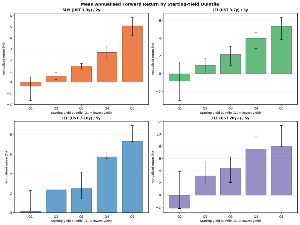
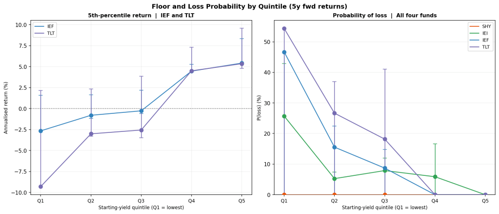
A higher starting yield comes with a higher worst-case return and a smaller chance of a loss, alongside the higher average.
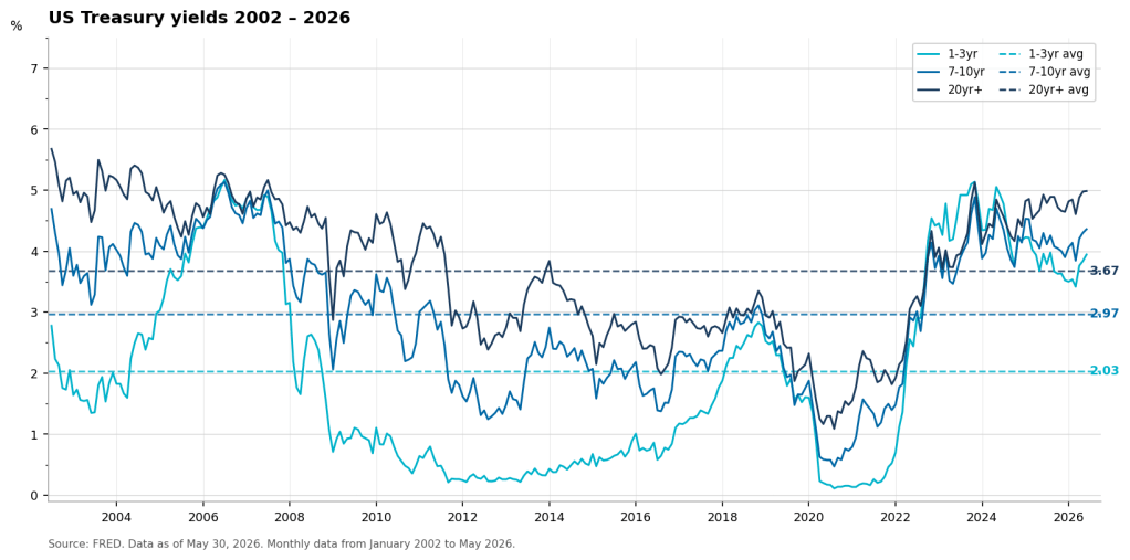
As of end-May 2026, all four Treasury buckets sit in the top fifth of their own history since 2003 pointing to the favourable end on both return and risk.
When is a good time to buy Treasuries?
Since the pandemic, Treasury yields have covered an enormous range. The 1-year yield sat near zero through 2021, then climbed above 5% by 2023, its highest since just before the GFC. Moves like that raise a question: when is a good time to buy Treasuries, and which yield level is actually attractive in terms of forward returns? The difference between a low and a high starting yield is bigger than it sounds. Over the past two decades, a 7–10 year Treasury ETF bought in its lowest-yield quintile returned roughly zero a year over the next five years, and lost money in almost half of those windows. Bought in its highest-yield quintile, it returned around 7% a year and never had a losing five-year window.
The idea that the yield you buy at largely sets the return you earn is not new; it has been studied for a long time and can be expressed as a simple formula. A bond’s return is its carry, plus roll-down the curve, plus the price change when yields move. The price change dominates in the short run and makes returns look random, but yields mean-revert, so it nets out over longer horizons and the starting yield dominates. This holds even for the constant-maturity ETFs most people own, which never actually mature.
That idea has been recently explored on the practitioner side. Janus Henderson showed that starting yields predict corporate-bond returns, with the link far tighter over five years than over one; Columbia Threadneedle made the broader case that the starting yield is the main driver of what a bond earns. I run the same question on US Treasuries to confirm the basic relationship as a baseline, and then explore two more questions. One is that a nominal yield is really a real yield plus expected inflation, so which part does the predicting. The other is that I look at the bad cases, where a higher starting yield turns out to shrink the losses. Then I use the framework on today’s yields – still well above their 2021 lows – and ask what they imply for returns from here.
Does the starting yield predict the return?
I proxy the constant-maturity Treasury buckets with four iShares ETFs: SHY (1–3 year), IEI (3–7 year), IEF (7–10 year) and TLT (20 year and over). Their total returns, taken from month-end adjusted closing prices. For each fund’s starting yield I use the matching constant-maturity Treasury yield from the FRED website – the 2-, 5-, 10- and 20-year – as a month-end snapshot on the same dates. The sample begins at each fund’s inception (July 2002 for SHY, IEF and TLT; January 2007 for IEI) and runs through mid-2026. From the monthly series I compute annualised total returns over one to ten years and match each to the yield that preceded it.
One limitation runs through everything below. Multi-year returns, measured monthly, are heavily overlapping: a five-year window beginning in January shares all but one month with the window beginning in February. So while I have a few hundred monthly observations, there’s only a handful of genuinely independent multi-year windows. Throughout I use standard errors that allow for the overlap, and treat any figure backed by few independent windows as merely suggestive.
Fund
1y
2y
3y
5y
7y
10y
SHY
0.79
0.93
0.92
0.74
0.72
0.66
IEI
0.59
0.76
0.8
0.73
0.7
0.84
IEF
0.49
0.68
0.77
0.86
0.87
0.9
TLT
0.32
0.5
0.6
0.73
0.74
0.87
Pearson correlation between each fund’s starting yield and its annualised return over the horizon.
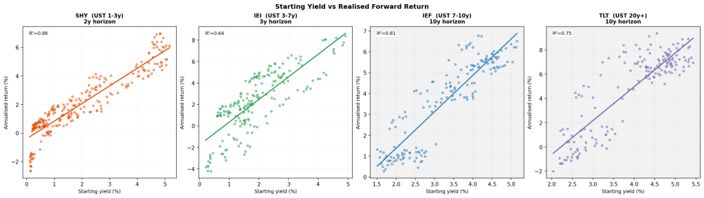
A clear pattern emerges from the table: the starting yield tracks the eventual return most closely when the holding period is near the fund’s maturity. For the short fund (SHY) correlation peaks at 2y and 3y and fades at longer horizons. For the longer funds the correlation is higher at 10y mark rather then at their maturities. The likely reason for that is few truly independent observations at 7y and 10y horizons.
Zooming in on one example, IEI, a 3–7 year ETF, correlates most strongly at ten years, not at three or five years. But a ten-year window needs a start by mid-2016, so IEI’s whole ten-year sample is trapped in 2007–2016 – less than one independent window, and lopsided: its only high yields sit in the 2007–08 patch, before the crisis pulled rates down to 1–2% for the rest of the sample. The figure is basically tracing a single rate cycle. Where the test window is wide enough to trust – 5y and under – the ordering behaves.
In every fund the average forward return rises from the lowest-yield bucket to the highest, step by step. The spreads are large: over five years the 7–10 year fund returned about 0% a year from its cheapest quintile and over 7% from its richest, and long bonds run from roughly −2% to +8%.
Regressing forward return on starting yield explains most of the variation – 86% for SHY at two years, and a similar 64–81% for the longer funds at their matched horizons, though those longer-horizon fits rest on only a couple of independent windows and are better read as shape than as precise numbers. The slope steepens with maturity: each extra point of starting yield adds a little over a point of annual return for the short fund and roughly three points for long bonds, because a longer fund’s price moves more for the same change in yield.
Real yield or inflation?
A nominal yield is the sum of two things: a real, inflation-adjusted yield – the inflation-adjusted and breakeven inflation, the market’s expected inflation over the life of the bond. TIPS make both identifiable. The TIPS yield is the real part, and the gap between the nominal Treasury yield and the TIPS yield is the breakeven. So I can ask which half of the yield actually carries the prediction. This needs matched real and nominal series, so I use IEI and IEF with the 5y return horizon, where the shorter sample still leaves enough independent windows to trust.
Independent variables are standartised so I can compare their coefficients directly. The real yield does almost all of the work. Its coefficients are two to three times larger than breakeven’s: a one-standard-deviation move in the real yield is worth one to two and a half percentage points of annual return, breakeven well under one.
Why? The real yield is compensation you lock in at purchase. Breakeven is only a forecast, so as a return signal the inflation half should be weaker. Another way to look at it is to switch the target from nominal returns to inflation-adjusted returns. If breakeven was pure inflation pass-through, it would help predict nominal returns but drop out of real ones. It doesn’t quite drop out – breakeven keeps a statistically significant coefficient even on real returns.
Why a higher yield is a safer one
So far this has all been about the average return you’d expect from a given starting yield. I work in market risk, so what I care about is what I can lose in the worst cases. To do that, I keep the same yield quintiles and look at the low end of each instead of the middle: the worst return the bucket produced, and how often it lost money.
Good news is that the floor rises with the starting yield. Take the IEF over five years as an example. Bought in its lowest-yield quintile, its worst five-year observation returned about −2.5% a year, and it lost money in nearly half of all windows. Bought in its highest-yield quintile, the worst it ever did was +5% a year and it never had a losing five-year window at all. Long bonds show the same shape but a wider spread.
The probability of losing money falls just as cleanly. For the same ETF it runs near half in the lowest-yield quintile and drops to zero by the top two. Higher starting yields raise the return you expect and cut the odds of a loss.
Where that leaves us
Let’s test what the framework tells us about future returns as of end of May 2026. Every one of the four buckets is trading in the top quintile counted since 2003. Short Treasuries yield about 4%, the 7-10y around 4.5%, long bonds close to 5%. In quintile terms, all four sit in Q5, the bucket this whole post has been about.
Our analysis says that it’s a good start. Bought in its top-yield quintile, the IEF fund should return about 7% a year over the following five years, with a worst case of +5%; long bonds would return around 8% with a floor of +4.5%; from SHY we should expect about 4% a year without any chance of overall losses.
Obviously, none of this is a promise, and certainly not investment advice (!!!). Twenty years of data on autocorrelated, slow-moving series affected by long business cycles isn’t enough to claim these results with certainty. But I lean on the direction rather than the exact numbers, and it points to favourable odds for these ETFs as the real yield, the part that matters most, positive rather than negative.
In this post I ask a practical question: in a constrained multi-asset portfolio, how much does the estimation machinery actually determine the result?
I test one Black–Litterman implementation across three asset universes, three estimation windows, two covariance estimators, two rebalancing frequencies, two transaction-cost assumptions and three tracking-error budgets. Within each specification, the Black–Litterman model is run at ten settings that progressively increase the weight placed on trailing sample returns relative to the equilibrium prior. Minimum variance, equal risk contribution and equal weight allocation methods provide controls.
The full experiment contains 216 specifications and 2,808 method-runs over a common ETF history from December 2007 to October 2025.
Three results dominate.
First, the tracking-error constraint determines the scale of the active portfolio. Once the Black–Litterman view weight is moderately high, further increases have almost no effect on realised tracking error. The confidence setting mostly determines how quickly the optimiser reaches the constrained region.
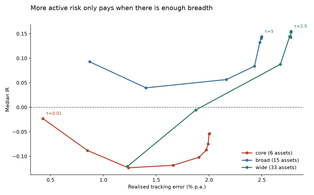
Second, the investment universe matters at least as much as the estimation method. Median information ratio for Black–Litterman is −0.08 in the six-asset universe, +0.12 with fifteen assets and +0.09 with 33 assets. More breadth helps initially, but the widest universe does not produce the best optimised result.
Third, the incremental return from estimation is difficult to separate from sampling noise. A block bootstrap for a representative wide-universe (of 33 assets) configuration produces an information ratio of 0.155 with a 95% interval of [−0.233, +0.561].
The controls are also informative. Minimum variance and equal risk contribution have negative benchmark-relative information ratios throughout this experiment, largely because their realised betas are well below the policy portfolio. Equal weighting performs very differently: it is poor in the six- and fifteen-asset universes but exceptionally strong with 33 assets.
This is not an argument against optimisation. In fact, the most important decisions are made before the optimisation even starts: how much active risk it is allowed to take and what opportunity set it is given. Fine tuning the estimation layer has a smaller effect.
The problem with standard optimiser tests
Portfolio optimisation is unusually easy to test unfairly.
One common problem is to rank benchmarked portfolios by Sharpe ratio. A minimum-variance portfolio can improve its Sharpe ratio simply by taking substantially less equity risk than the policy portfolio. That may be a useful portfolio, but it is not evidence that the optimiser has added benchmark-relative return.
For that reason, the main metric here is information ratio:
Alpha and beta relative to the policy portfolio are reported alongside it.
A second problem is dimensionality. Covariance estimation with 6 assets and roughly 63 to 252 daily observations is a different problem from estimation with 33 assets. At the shortest window in the wide universe, the observation-to-dimension ratio is only 63/33 or 1.91. The sample covariance remains full rank, but it is poorly conditioned.
A third problem is unconstrained optimisation. Institutional portfolios normally operate relative to a policy portfolio and within explicit active-risk limits. Testing an unconstrained optimiser therefore answers a different question from the one most benchmarked mandates face.
The experiment is designed around those three issues.
Experimental design
Benchmark-relative risk
Black–Litterman and minimum variance are subject to an ex-ante tracking-error constraint:
with annualised budgets of 1%, 2% and 4%.
The constraint uses the covariance estimate available at the rebalance date. Realised tracking error reported later is therefore not expected to equal the nominal budget exactly.
The fixed policy portfolio and equal weight are analytic controls. The equal-risk-contribution (ERC) implementation is unconstrained and unlevered, so its risk level can differ materially from policy.
Three investment universes
The portfolios contain 6, 15 or 33 assets, but each expresses the same strategic stance: 60% equity and 40% fixed income, allocated across six sub-classes: US equity, developed ex-US equity, emerging markets, government and agency debt, US credit, and real assets. What changes across the universes is the granularity of implementation within the asset roles.
The core universe contains six liquid ETFs: SPY, EFA, EEM, IEF, LQD and TIP – one instrument for each role and a portfolio a generalist investor could plausibly hold.
The broad universe expands to fifteen assets. US equity is split into large and small cap, the Treasury allocation is spread across SHY, IEF and TLT, and the opportunity set adds high yield, REITs and commodities while preserving the same six strategic roles.
The wide universe contains thirty-three assets. A single US equity allocation is replaced by the nine S&P sector SPDRs, rates are represented by a seven-instrument curve that also includes international sovereign bonds and agency MBS, and real assets are separated into gold, silver and broad commodities.
Within each strategic role, weights are divided equally across its constituent instruments rather than market-cap weighted. The role weights themselves are unchanged across the three universes. The experiment therefore increases the number of securities and the dimensionality of the estimation problem without intentionally changing the portfolio’s strategic exposure.
This lets me separate two questions that are usually mixed together: whether a richer opportunity set gives the optimiser more useful choices, and whether the resulting increase in estimation difficulty offsets that benefit.
The Black–Litterman dial
The Black–Litterman implementation starts from reverse-optimised equilibrium returns calibrated to an implied Sharpe ratio of 0.35.
A parameter denoted τ controls the weight placed on the trailing sample-mean view relative to that prior. τ=0 reproduces policy and increasing τ places progressively more weight on recent realised returns.
The settings for τ parameter are: 0, 0.01, 0.025, 0.05, 0.10, 0.25, 0.50, 1.00, 2.50 and 5.00.
Estimation and rebalancing
At each rebalance date, the optimiser estimates expected returns and covariance from the daily returns available up to that point. The lookback window is 63, 126 or 252 trading sessions; daily moments are then scaled to the 21-session investment horizon.
Scaling daily moments provides substantially more observations but it comes with the approximation trade-off. Scaled daily volatility overstates realised horizon volatility by roughly 21% for equities and 4% for Treasuries. Stock/bond correlation is approximately −0.29 using daily observations and −0.06 at the holding horizon.
The covariance estimate is calculated in two ways: the ordinary sample covariance and Ledoit–Wolf shrinkage. The latter regularises the sample estimate by pulling it toward a more stable target, reducing the influence of noisy pairwise correlations. The distinction should matter most when the amount of data is small relative to the number of assets. In the 33-asset universe with a 63-session window, the observation-to-dimension ratio is only 1.91. Comparing the two estimators across the grid therefore lets me test whether a more stable covariance estimate helps as the estimation problem becomes harder.
Once the estimates are formed, the portfolio is optimised and rebalanced. The rebalances happen at the end of 21-trading day blocks so every holding period contains the same number of days. The grid also tests a lower-frequency rebalance rule of 63 days, allowing me to separate the effect of changing estimates from the cost of acting on them more often.
Once the new weights are set, they drift with asset returns until the next rebalance. Transaction costs of 10 bp and 25 bp are applied to the turnover between end-of-period drifted weights and the new target weights.
Each specification contains 13 methods: ten Black–Litterman settings, minimum variance, equal risk contribution and equal weight. That generates 2,808 method-runs. Dispersion in results should be interpreted as sensitivity to specification choices as the runs aren’t independent because they use the same underlying history.
1. The budget sets the scale
The clearest result appears when realised tracking error is plotted against the Black–Litterman view-weight parameter. In the 33-asset universe, realised tracking error rises initially and then flattens:
τ
1% ex-ante budget
2% ex-ante budget
4% ex-ante budget
0
0.00
0.00
0.00
0.01
1.14
1.31
1.33
0.025
1.41
2.15
2.41
0.05
1.42
2.68
3.33
0.10
1.42
2.76
4.14
0.25
1.42
2.77
4.70
0.50
1.42
2.77
4.87
1.00
1.42
2.77
4.92
2.50
1.42
2.77
4.95
5.00
1.42
2.77
4.95
Figures are median realised annualised tracking errors, in %. The nominal 1%, 2% and 4% limits are ex-ante constraints based on estimated covariance, so realised values need not equal them.
For the 1% and 2% budgets, little changes beyond about τ=0.10. At the 2% budget, for example, increasing τ fiftyfold from 0.1 to 5 increases median realised tracking error only by 0.01%.
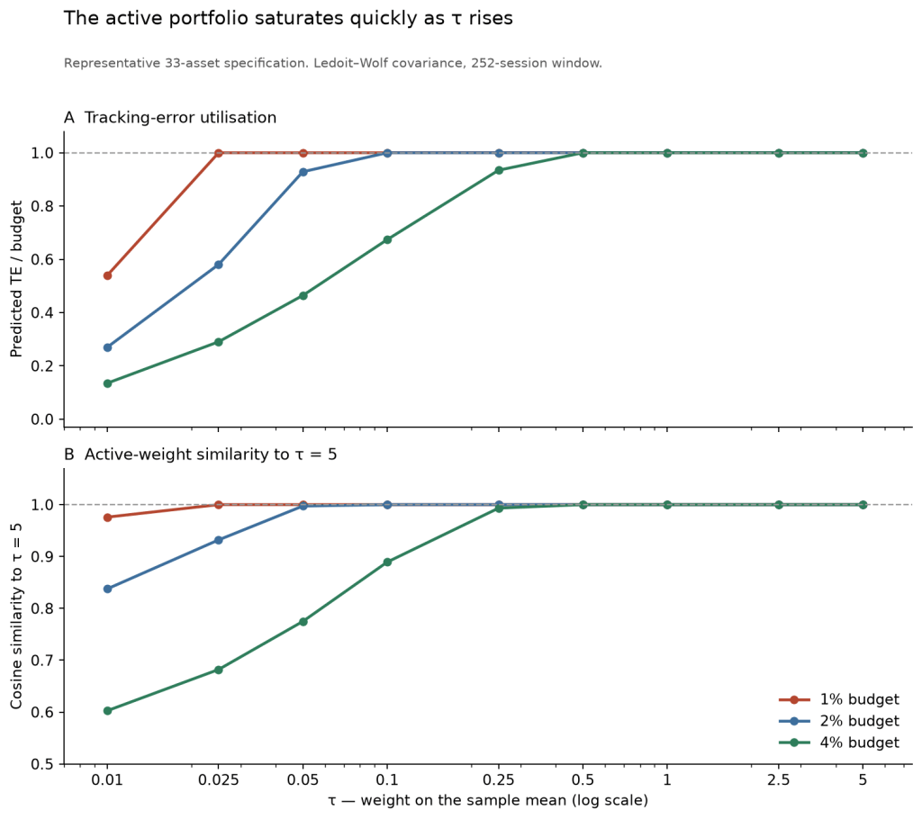
That result tells us that the portfolio has saturated, but not why. Higher-τ portfolios might all be running into the tracking-error constraint, or they might simply have converged to the same active portfolio before the constraint is reached.
The rebalance-date diagnostics separate those effects.
In the representative 33-asset specification, panel A shows ex-ante tracking-error utilisation: predicted tracking error divided by the permitted budget. Panel B shows cosine similarity between the active-weight vector at each τ and the corresponding τ=5 portfolio. A cosine similarity of 1 means the portfolios point in the same active-weight direction, although their magnitudes can differ.
The tight budgets saturate quickly. At the 1% budget, median utilisation reaches 1.00 by τ=0.025 and the active-weight direction is already identical to the τ=5 portfolio. At 2%, similarity is 0.997 by τ=0.05 and reaches 1.000 by τ=0.25, when the constraint is also binding on almost every rebalance date.
The 4% budget helps separate direction from scale. The active portfolio is effectively pointing in its final direction by τ=0.5, even though the tracking-error constraint is within 0.1% of its limit on only 65% of rebalance dates at that setting. Increasing τ further therefore adds little information about where the optimiser wants to go as the risk budget determines how far it is allowed to go.
The mechanism therefore can be described as: the expected-return signal settles quickly on an active direction, while the tracking-error budget limits the size of that active position. Once both have saturated, further increases in τ have almost no portfolio-level effect.
For governance, the implication is straightforward. The economically relevant range of τ is narrow. Beyond it, fine tuning the confidence setting changes little, while the tracking-error budget continues to determine how much benchmark-relative risk the portfolio can take.
2. Breadth determines how much active risk is useful
The optimiser behaves very differently as the opportunity set expands. The table below covers the 648 Black–Litterman runs with τ > 0 in each universe.
Universe
Assets
Median IR
IR Range
Specs with IR > 0
Median beta
Core
6
−0.079
[−0.17, +0.01]
27.5%
0.988
Broad
15
+0.121
[+0.01, +0.20]
76.4%
0.948
Wide
33
+0.085
[−0.03, +0.21]
68.8%
0.943
The Core universe gives the optimiser little to work with. Its median information ratio is negative and fewer than a third of specifications are positive.
Moving to fifteen assets changes the result materially. Median information ratio rises to +0.121 and more than three-quarters of specifications are positive. Expanding again to the Wide universe does not improve the median result: information ratio falls to +0.085.
Breadth therefore helps, but not monotonically. Going from six to fifteen assets creates useful additional choices. Going from fifteen to thirty-three adds still more choices, but also a harder estimation problem and more trading. In this sample, those costs offset some of the additional opportunity.
The amount of active risk that can be used productively changes with the universe as well:
Ex-ante TE budget
Core
Broad
Wide
1%
−0.040
+0.203
+0.034
2%
−0.053
+0.066
+0.123
4%
−0.113
+0.075
+0.140
The pattern is clearest at the extremes. In the six-asset universe, allowing more deviation makes performance steadily worse. In the thirty-three-asset universe, the ordering reverses: the 4% budget produces the highest median information ratio. The fifteen-asset universe does best with the tightest, 1% budget.
The same interaction appears when realised tracking error is plotted against information ratio as τ increases. In core, moving further from policy does not improve the result. Broad remains positive over a useful range of active risk. Wide benefits from greater deviation before performance levels off.
This matters because a tracking-error budget has no useful interpretation in isolation. A 4% budget may be sensible when the optimiser has thirty-three instruments through which to express a view and damaging when it has only six. A narrow universe with a loose risk budget gives the optimiser more freedom without giving it more independent opportunities.
Median betas remain between 0.94 and 0.99 for the Black–Litterman runs, so these differences are not primarily the result of large changes in market exposure.
The practical conclusion is not that wider universes are always better, or that tighter budgets are always safer. Breadth and active-risk budget need to be chosen together. The opportunity set determines what the optimiser can do; the budget determines how much room it has to do it.
3. Shrinkage does not help where expected
One reason for varying the covariance estimator was to test a simple prediction: Ledoit–Wolf shrinkage should help most when the number of observations is small relative to the number of assets.
The results do not support that prediction.
Estimation region
IR change from Ledoit–Wolf
Fewer than 4 observations per dimension
−0.009
At least 4 observations per dimension
+0.051
Hardest point: 63/33 = 1.91
−0.008
At the hardest point in the grid, shrinkage produces essentially no improvement there. More broadly, its median contribution is slightly negative when the ratio is below four and positive in the easier estimation region.
That is the opposite of what I expected. It does not mean shrinkage is ineffective in general. In this experiment, its theoretical advantage in the most data-constrained settings does not translate into better realised benchmark-relative performance.
One possible explanation is that when the covariance estimate becomes sufficiently unstable, portfolio constraints limit the effect that differences between estimators can have on the final allocation.
4. Simple controls are hard to beat
The control portfolios help separate two different questions: whether an optimiser produces a sensible portfolio, and whether it adds value relative to the policy portfolio.
Minimum variance and equal risk contribution perform poorly on the second test.
Runs
Positive IRs
Median IR
Median beta
432
0
−0.462
0.624
None of the 432 runs has a positive information ratio. The median beta of 0.624 explains much of the result: these portfolios take substantially less policy risk.
That does not make minimum variance or ERC bad portfolios. It means that if they are used unlevered, they answer a different question. They reduce absolute risk rather than trying to improve returns relative to the policy portfolio. Information ratio makes that distinction explicit. Only 0.2% of the runs produce an alpha t-statistic above 2 in absolute value.
Equal weighting is the more demanding control because it uses the same opportunity set without estimating either expected returns or an optimal covariance-based allocation.
In the Wide universe, it is the strongest method in the study:
Median information ratio
+0.685
Positive specifications
72 of 72
Median alpha
+0.52%
Median alpha t-statistic
+2.65
Specifications with alpha t > 2
100%
Median beta
1.023
Median realised tracking error
0.94%
The result is not a general case for equal weighting. In the Broad universe its information ratio is about −0.42, and in the six-asset universe about −0.78. Its success appears only when the opportunity set is sufficiently broad.
That makes the result more useful, not less. In the Wide universe, much of what looked like an optimisation opportunity was also available from a simple diversification rule. Equal weight achieved a substantially higher information ratio while taking less active risk: median realised tracking error was 0.94%, compared with about 2.59% for the Black–Litterman runs.
The comparison is not perfectly risk-matched but it does establish an important benchmark for practice: before attributing value to the estimation machinery, check whether a simple rule on the same universe captures the same opportunity more efficiently.
In this experiment, the wide-universe optimiser does not clear that bar.
5. Trading costs do not explain the main result
Black–Litterman (B-L) turns over roughly 140% a year compared to 10% for the policy portfolio. So implementation costs are a plausible explanation for weak performance. The backtest therefore applies one-way trading costs and asks a practical question: at what cost does each strategy’s information ratio fall to zero?
Method
IR at 0bp
3bp
10bp
25bp
Break-even
B-L, Core
+0.052
+0.033
−0.023
−0.145
7.6bp
B-L, Broad
+0.234
+0.213
+0.163
+0.030
29.0bp
B-L, Wide
+0.264
+0.211
+0.147
−0.014
23.7bp
EW, Wide
+0.686
+0.686
+0.685
+0.684
>50bp
The six-asset optimiser has little room for execution costs. Its estimated break-even is only 7.6bp one way. The broader universes are more robust: broad remains positive to about 29bp and wide to about 24bp.
That distinction matters because it rules out a simple explanation for the breadth result. The optimiser is not failing in core merely because a more diversified portfolio trades more. Even before costs, Core has only a small positive information ratio, while Broad and Wide start materially higher.
Equal weight is the clearest control. Its information ratio barely changes across the cost sweep because turnover is low. More importantly, it already outperforms the optimised methods at zero cost. Trading costs therefore widen the gap but do not create it.
The conclusion is straightforward: costs matter, but they do not overturn the main comparisons in the study. In the broader universes the optimiser survives a substantial cost burden, while equal weight retains its advantage even when trading is assumed to be free.
6. Historical uncertainty remains large
The 216 specifications vary multiple parameters but they don’t provide 216 independent tests of the strategy.
Agreement across the grid therefore tells us that a result is robust to modelling and implementation choices. It does not tell us how reliably the result would repeat in a different historical period.
That distinction matters for the Black–Litterman results. A positive median information ratio across many specifications can arise because the underlying signal genuinely has a positive expected return, but it can also arise because the common sample happened to favour that signal. Changing the estimation window or covariance estimator does not create a new history.
To measure that second source of uncertainty, I use a circular block bootstrap on a representative wide-universe Black–Litterman specification. Twelve-block resampling windows preserve some of the serial dependence in returns, and the strategy is evaluated across 1,000 bootstrap histories.
Information ratio: 0.155
95% bootstrap interval: [−0.233, +0.561]
The interval is wide and confidently crosses zero threshold. For that configuration, the available history does not provide enough evidence to distinguish the estimated active return from sampling variation.
This does not contradict the earlier robustness results. The specification grid asks whether the conclusion survives reasonable changes to the way the strategy is implemented. The bootstrap asks how uncertain the result remains because we have observed only one sequence of market returns.
For practitioners, both matter. A result that disappears when the lookback window changes is fragile in one sense. A result that survives every such choice but has a wide bootstrap interval is fragile in another.
The evidence here is strongest on the first question. The main findings – rapid saturation of the confidence setting, the interaction between breadth and active-risk budget, and the strength of the simple controls – recur across many specifications. The evidence that Black–Litterman contributes a positive expected active return is much weaker.
What I take from the experiment
The experiment does not show that portfolio optimisation is useless. It shows that some decisions matter much more than others.
The first is the active-risk budget. In the Black–Litterman runs, increasing the confidence setting initially changes the portfolio, but the effect fades quickly. The active direction converges, and the tracking-error constraint then determines how much of that position can be expressed. Fine tuning the confidence parameter beyond that point adds little.
The second is breadth. Moving from six to fifteen assets materially improves the opportunity set, but moving from fifteen to thirty-three does not improve the optimised result further. The useful amount of active risk also changes with the universe: tight budgets work best in narrower opportunity sets, while the widest universe benefits from more room to deviate.
The estimation layer matters less than I expected. Ledoit–Wolf shrinkage does not improve realised performance where the covariance problem is hardest, despite a strong theoretical reason to expect it to. That is a useful negative result. More sophisticated estimation does not automatically translate into a better portfolio once constraints and implementation choices are imposed.
The simple controls are equally important. Minimum variance and ERC are poor benchmark-relative substitutes for the policy portfolio when left unlevered, largely because they take much less policy risk. Equal weight presents a harder challenge. In the 33-asset universe it beats every optimised method in the study while taking less active risk and turning over far less. That result does not generalise to the narrower universes, but it does show that some of the apparent benefit of optimisation in the wide universe comes from breadth itself rather than from estimation.
Trading costs do not change that interpretation. Black–Litterman remains viable at plausible execution costs in the broader universes, but equal weight already has the advantage at zero cost. Costs matter for implementation, not for explaining the main ranking of methods.
The final qualification is statistical. The grid contains 216 specifications, but they all draw on the same history. Their agreement shows robustness to modelling choices; it’s not independent confirmations of an expected return. The bootstrap analysis clarified that the estimated Black–Litterman edge remains too uncertain to separate confidently from sampling variation.
For a practitioner, I would therefore put the decisions in this order: choose the opportunity set, set the active-risk budget, benchmark against simple rules, and only then spend time refining the estimator. The optimiser still matters, but it operates inside choices that have already determined much of what the portfolio can become.
How conflicting return assumptions and risk models create unintended portfolio bets
An investor rarely gets every portfolio input from one coherent source. Long-term return assumptions – often called capital-market assumptions (CMAs) – may come from a research provider, an adviser, or the investor’s own valuation work. Volatility, correlations, and factor exposures may come from another model or portfolio tool. Once combined in an optimizer, they become parts of the same investment model.
A return forecast may reward a modelled risk differently from the baseline factor premia, or include return the declared pricing map cannot represent. Neither difference proves the forecast wrong but if the mismatch is not identified, the optimizer can turn it into an unintentional portfolio. In this post I show two separate sources of disagreement, then test how each affects allocation.
Let’s say your long-term assumptions state that high-yield bonds should earn 4.5% above cash. Your risk model maps the same asset as 0.4 units of equity risk and 1.0 unit of credit risk. Priced at your baseline factor premia those exposures imply only 3.1% return. Then, where did the missing 1.4% come from?
I use a stylized example below to illustrate the diagnostic, with all returns expressed as annual excess returns over a common cash benchmark. The comparison assumes that the factor model is intended to explain expected returns as well as risk. If the model is used only to estimate covariance, a gap between the return forecast and the factor-implied return is not necessarily an inconsistency.
One residual, two diagnoses
Let contain the asset forecasts, the exposures, and the chosen baseline factor premia – here 4% for equity and 1.5% for credit. The first diagnostic is the baseline-premium residual, which tests agreement with those factor prices:
The baseline-implied return is , what each asset earns if the factors are priced at baseline. High yield, for instance, carries 0.4 of equity risk and 1.0 of credit, so it implies – against a 4.5% forecast, a baseline residual of 1.4%. Real estate implies the same 3.1% and leaves 1.3%. Equities map only to the equity factor and imply their 4% exactly.
Asset
Equity beta
Credit beta
Return assumption
Baseline-implied
Anchor-fit
Baseline residual
Spanned repricing
Anchor-fit residual
Global equities
1.0
0
4%
4%
4%
0%
0%
0%
High-yield bonds
0.4
1.0
4.5%
3.1%
4.5%
1.4%
1.4%
0%
Listed real estate
0.7
0.2
4.4%
3.1%
3.38%
1.3%
0.28%
1.02%
The two baseline residuals are similar by design. Whether they share a single explanation is the question.
Ask whether any pair of factor premia can reproduce all three forecasts. Global equities fixes the equity premium at 4%. High yield then fixes credit premia:
These two assets are the anchors, and by construction they are fit exactly — which is why their anchor-fit returns equal their forecasts and their anchor-fit residuals are zero. Only real estate, left out of the anchoring, can miss. At the anchored prices it earns not its 4.4% forecast, leaving 1.02% unexplained under that pricing map. So under Eq/HY anchoring, high yield’s entire 1.4% is attributed to credit repricing – 2.9% rather than 1.5%. That is a substantial repricing to challenge, but it requires no new factor. Real estate’s 1.3% splits into 0.28% of the same repricing and a 1.02% anchor-fit residual.
Those last three columns are one identity read across the table. The anchored decomposition is
with and : the baseline residual equals spanned repricing plus anchor-fit residual, row by row. For real estate, . The first term is disagreement over the prices of modelled risks; the second is what survives after the anchors are fit. Those two anchors pin the premia exactly because two assets fix two factors – a feature of the choice rather than evidence that equities and high yield are perfectly priced. Anchor on a different pair and the same inconsistency moves elsewhere.
When the residual becomes a bet
A disagreement matters only when it changes what the portfolio owns. Hold the covariance matrix and constraints fixed, and vary only the expected-return vector. Run 1 uses the original return assumptions. Run 2 removes real estate’s 1.02% anchor-fit residual and nothing else – it still accepts the 2.90% credit price the equity and high-yield forecasts imply. Run 3 goes further, replacing that fitted 2.90% credit premium with the baseline 1.50%.
A few extra assumptions I made for the optimizer runs:
Factor volatilities are 16% for equity factor and 6% for credit factor, with 0.3 correlation.
Idiosyncratic volatilities are 2%, 4%, and 8% for equities, HY, and RE.
Each run solves with , long-only and fully invested weights, and a 60% cap per asset.
Portfolio result
Original (Run 1)
Anchored span fit (Run 2)
Baseline factor-implied (Run 3)
Global equities
0%
40%
60%
High-yield bonds
60%
60%
40%
Listed real estate
40%
0%
0%
Expected excess return
4.46%
4.30%
3.64%
Volatility
11.06%
12.10%
13.23%
Sharpe ratio
0.403
0.355
0.275
The first change, Run 1 to Run 2, eliminates real estate. That position depended on a return the anchored pricing map could not express. The second change from Run 2 to Run 3 shifts 20 percentage points from high yield to equity. That position depended on disagreement about the price of credit. These allocation changes are the test itself.
A few features of the table are worth flagging. Volatility climbs from left to right even as expected return falls. It looks backwards until you follow the weights: stripping out the residual return pushes the optimizer into equities, the highest-volatility factor, while the 60% cap forces corner portfolios. Because every figure is measured over cash, the last row is a model-implied ex ante Sharpe ratio.
Risk enters here for the first time, and it is built from the same . The covariance matrix is – the exposures that price each asset in also channel the factor covariance , while carries the asset-specific volatilities. That shared is what makes a return residual consequential. A residual lifts an asset’s expected return but it’s not connected to any factor exposure, so it never enters the systematic block ; its only risk charge is the diagonal in which in principle is diversifiable. The 1.02% anchor-fit residual then looks like return you can get for a small, diversifiable cost, which is why real estate gets 40% allocation in Run 1 and vanishes when the residual is removed from the return vector.
That the optimizer charges the residual only diagonal risk is the exact danger. If real estate’s 1.02% is really compensation for a systematic exposure the pricing map omits then its true risk is correlated, and the model has booked it in the wrong place. The position looked efficient only because and described its source in incompatible terms.
Make the residual intentional
Unexplained does not mean illegitimate, it’s simply undeclared. A residual might reflect a deliberate valuation view, manager skill, liquidity compensation, a missing systematic exposure, structural complexity, or plain optimism. The diagnosis tells you where to look; the response is a choice among four treatments, and the work before that choice is making sure the residual is real.
First, rule out data artifacts. Normalise the inputs before trusting any gap: align total versus excess returns, cash, currency and hedge carry, horizons, leverage, financing, and implementation costs. If a residual survives this, it’s worth explaining.
Then separate the two maps. Decide whether the model is a risk map, a pricing map, or both. A full implementation may use in and a narrower in . Only against a declared pricing map does “off-span” mean anything. For a larger universe, define it through a weighted projection. Assuming has full column rank,
and the baseline-premium residual separates precisely as .
The projection is only as meaningful as its metric . The metric should reflect confidence in the expected-return estimates. If is the covariance of long-term-return forecast errors, confidence weighting sets . Or it can an inverse of idiosyncratic asset volatilities.
With a real residual isolated, every material one admits four defensible treatments:
Revise the expected return.
Remodel risk to include the missing exposure.
Retain it as an explicit view, with a confidence and a residual-risk assumption.
Constrain its allocation effect when full integration is impractical.
The second treatment is a modelling question: if a genuine exposure is missing, add or remodel it. For listed real estate that means investigating rates and duration, term risk, leverage and credit, property sector and so on.
The third treatment allows you to scale the residual based on your conviction. For the anchored example, letwith a confidence weight; a larger portfolio applies the same logic to .
Which points to a practical rule – you need to record why every retained off-span view exists, assign it explicit confidence, and impose an allocation or active-risk limit whenever it moves any portfolio weight by more than X% or creates active risk exceeding Y% of the volatility target. Confidence-weighted views follow the logic of Black and Litterman. The factor-span geometry and its metric dependence are established in the alignment literature1.
Conclusion
Two assets began with nearly identical baseline-premium residuals. High yield’s 1.40% opened a question whether credit factor should earn 1.5% or 2.9%. Real estate’s residual clearly sat outside the model, and left the reason open: a missing exposure or an investor’s custom view.
Consistency is a portfolio-design property – a perfectly aligned forecast can still be wrong, while a deliberate and controlled inconsistency can be defensible. The aim is not to eliminate everything the risk model cannot explain. It is to ensure the optimizer never acts on an unexplained return by accident.
I test two versions of buying the dip from 1962 to 2025. One keeps 10% in Treasury bills and the other starts at 60/40 and raises equities to 90%. Both deploy after a 20% market drawdown and reset when the market reaches a new high.
Both dip buyers beat the static portfolios they started from, but they also held more equity on average and suffered deeper drawdowns. The cash version still finished behind 100% equities, while the bond version had a lower Sharpe ratio than 60/40.
After matching the average equity exposure, timing added some return under the −20% rule. Allocation also mattered, so the result cannot be read as a pure reward for buying cheaply.
The timing evidence is weak. The regression alphas are not statistically significant, the timing result turns negative with a −10% trigger, and the base test contains only twelve deployments. I would treat it as a result for this particular rule, not a general law about buying dips.
What does a dip buyer actually do?
Ask whether buying the dip beats buying and holding, and the intuitive answer – of course it does, you are buying the same thing cheaper – assumes that the discount is what does the work. It usually is not that simple.
A dip buyer who keeps a reserve is running two strategies stapled together. There is timing – buying after prices fall – but there is also allocation. Hold cash or bonds between selloffs and more stock after them, and over a full cycle the portfolio settles at some average equity weight. Timing is a claim about when to buy and allocation is simply how much equity risk the rule carried.
This question has been tested before. Nick Maggiulli gives an investor perfect knowledge of every future bottom and still finds that regular monthly investing wins in most 40-year windows. Benjamin Felix and Braden Warwick reach a similar conclusion across several national and global equity markets. Waiting reduces returns, while much of the apparent downside protection comes from the cash held before the trigger.
Bonini, Shohfi and Simaan formalise the rule and show how much the result depends on the starting market environment and the chosen dip size. AQR tests 196 variations and finds little reliable alpha after adjusting for average market exposure.
Most of this work treats dip buying as an entry decision: cash arrives, waits for a fall and then goes into stocks. Here the dry powder is already inside the portfolio – cash in a 90/10 allocation or bonds in a 60/40 one. It’s deployed after a 20% fall, rebuilt at the next high and used again. I compare each rule with a static portfolio holding the same realised average equity weight. The gap between them is the part attributable to timing rather than the allocation the rule happened to create.
The setup
I run a daily backtest using total returns. US equity and one-day T-bill returns come from the Ken French Data Library; the bond leg is a 10-year Treasury total-return series I build from FRED’s constant-maturity yield with the standard duration approximation, the same construction I have used before. The sample runs from January 1962 to July 2025, with dividends and interest reinvested and every portfolio starting at $1.
I test five portfolios:
Equity buy-and-hold. 100% US equity market allocation.
Static 90/10. 90% equity and 10% cash, rebalanced monthly.
Static 60/40. 60% equity and 40% bonds, rebalanced monthly.
Cash-reserve dip buyer. Starts at 90/10. When the market closes at least 20% below its prior high, it puts the whole cash reserve into stocks. At the next new high it rebuilds the 10% cash reserve.
Bond-funded dip buyer. Starts at 60/40. On the same −20% trigger it increases equity allocation to 90%, funded from bonds, and resets to 60/40 at the next new high.
Each dip buyer also gets a static twin holding its realised average equity weight and rebalanced monthly. I use those twins below to separate allocation from timing.
How the portfolios behaved
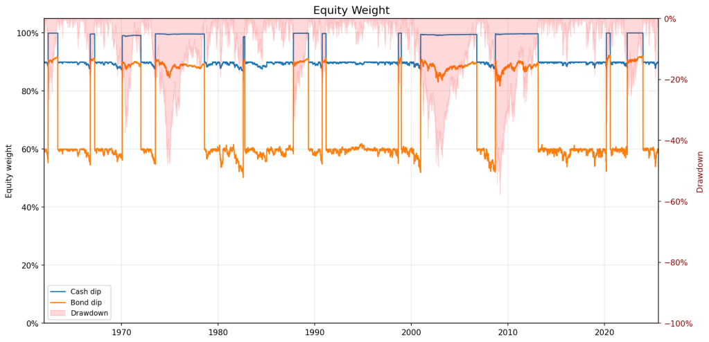
Below are the dip buyers’ equity weights, with the market drawdown shaded in red.
Whenever the market crosses the trigger, equity exposure rises – to 100% for the cash dip strategy and 90% for the bond dip one – into the 1970s bear market, Black Monday, the Dot-com bust, the GFC and COVID. The rule commits capital while prices are falling and other investors are selling, which is exactly why it feels disciplined.
The trigger often arrives too early in the worst bear markets. Once the market reaches the threshold, the reserve is spent in one go, leaving nothing for lower prices later in 1973–74, 2000–02 and 2008. From there, the strategy owns more equity until the market gets back to its previous high, however long that takes. A quick rebound is ideal. In a long bear market, it rides the rest of the decline with the maximum equity allocation.
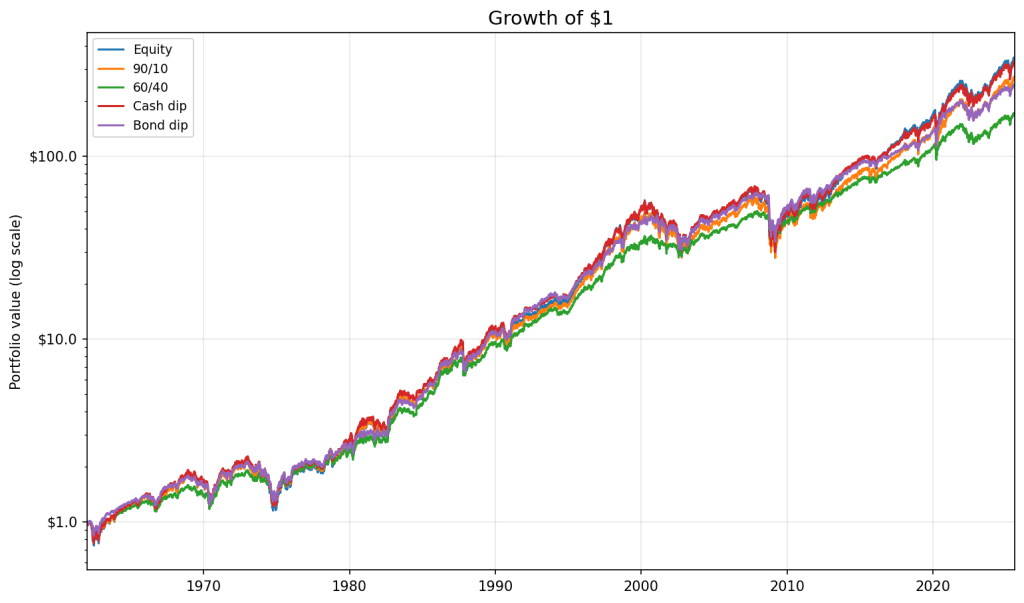
It looks promising on the chart but the wealth paths are more ordinary.
The CAGR ranking mostly follows equity exposure:
Portfolio
CAGR
Vol
Sharpe
Max DD
Avg eq weight
Final wealth
Equity
9.75%
16.2%
0.39
−57.8%
100.0%
$346
Cash dip
9.66%
15.3%
0.40
−56.5%
93.2%
$330
Static 90/10
9.32%
14.5%
0.39
−53.6%
90.0%
$271
Bond dip
9.16%
12.4%
0.42
−46.1%
69.9%
$247
Static 60/40
8.54%
9.9%
0.45
−34.9%
60.1%
$172
The cash-reserve strategy sits below 100% equity and above static 90/10, where its 93% average equity weight would put it. The bond-funded strategy sits between 60/40 and 90/10, where its 70% average weight would put it.
The cash-reserve dip buyer returned 9.66% a year against buy-and-hold’s 9.75%. Its timing was useful, but not useful enough to pay for the return forgone while the reserve stayed in T-bills. Both gains came with higher volatility and deeper drawdowns than the static starting portfolios. Static 60/40 still had the highest Sharpe ratio.
More equity or better timing?
The dip buyers do not keep the equity weights they start with. The cash strategy averaged 93.2% in equities rather than 90%; the bond strategy averaged 69.9% rather than 60%. A straight comparison with 90/10 or 60/40 therefore mixes two things: owning more stock and changing the weight after drawdowns. I want to separate them.
I do that in two ways. The first is a matched-weight decomposition. For each dip buyer I build a static twin with the same average equity weight and the same reserve asset. The twin rebalances monthly and never reacts to a drawdown. I then calculate:
Total edge: dip buyer minus its original benchmark – static 90/10 for the cash strategy and static 60/40 for the bond strategy.
Allocation: static twin minus the original benchmark.
Timing: dip buyer minus the static twin.
The second method follows the basic regression approach used by AQR in Hold the Dip. I regress each strategy’s daily return above cash on the market’s daily return above cash. Beta estimates its market exposure; the annualised intercept is the return left after adjusting for that exposure. Newey-West standard errors provide the t-statistic.
The two methods answer slightly different questions. The matched-weight calculation splits the strategy’s CAGR and keeps the same cash or bond funding asset. The regression works with daily returns, controls for market beta and tells me whether the estimated alpha is distinguishable from zero. It is a single-factor model, so I use it rather as a cross-check.
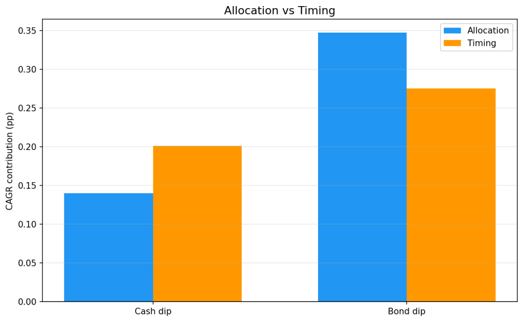
The chart shows the matched-weight split. The final three columns of the table show the regression result.
Strategy
Baseline
Total edge
Allocation
Timing
Beta
Ann. alpha
t(alpha)
Cash dip
Static 90/10
+0.34%
+0.14%
+0.20%
0.95
+0.13%
1.10
Bond dip
Static 60/40
+0.62%
+0.35%
+0.28%
0.74
+0.57%
1.22
For cash portfolios, the returns are 9.32% for static 90/10, 9.46% for the matched twin and 9.66% for the dip buyer. The first step contributes 0.14% from allocation; the second contributes 0.2% from timing. For bonds, the sequence is 8.54%, 8.89% and 9.16%, giving 0.35 points from allocation and 0.28 from timing.
Both regressions also produce positive estimates: 0.13% for cash and 0.57% for bonds. But the t-statistics are only 1.10 and 1.22, so neither is statistically significant. Both methods point in the same direction but the regression says the evidence is weak.
I call the matched-weight residual timing, but it is not a score for how close each purchase came to the bottom. It captures the whole path of moving equity exposure around the average weight. Nor is this a Sharpe decomposition: cash improved its Sharpe ratio only slightly relative to 90/10, while the bond strategy’s Sharpe fell relative to 60/40.
Why waiting is expensive
Waiting is expensive because equities have a positive expected return. A dip reserve held for the next drawdown spends much of its life earning bill rates while the market compounds without it. The strategy gives up part of the equity premium before it gets the chance to buy anything at a discount.
Dip buying also bets against momentum. It buys after declines, leaning against the market’s tendency to trend – the same point AQR makes in Hold the Dip. That does not make every purchase after a fall a mistake, but reversal is not a free source of return.
The weight chart shows why allocation and timing are easy to mix up. Raising equity exposure in a crash and holding it through the recovery also raises the strategy’s average equity weight. The static twin captures that part. Timing is only the return from moving around that average, not the return from carrying it in the first place.
The extra exposure shows up in the drawdowns. The cash-reserve strategy lost 56.5% at its worst, only slightly less than buy-and-hold’s 57.8%. The bond-funded strategy lost 46%, against 35% for static 60/40. That is what carrying more equity risk looks like on the way down.
How robust is the timing edge?
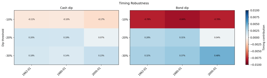
Each cell re-runs the matched-weight test with a different trigger and starting date. It shows the dip buyer’s CAGR minus the CAGR of its static twin, so a positive number means that changing the equity weight helped after controlling for average equity exposure.
At −10%, timing is negative in every window: roughly −0.1 to −0.2 points for cash and about −0.8 for bonds. At −20%, it is positive over the full sample but nearly disappears when the test starts in 2000. At −30%, it is positive in every window.
A 10% rule is often triggered while the sell-off is still developing. A 20% or 30% rule enters later but ends up betting on a much smaller set of severe declines. The positive result therefore belongs to a narrow version of dip buying – late and rare – rather than to buying weakness in general. With so few deep drawdowns to learn from, it is hard to know whether the edge will repeat.
So, did buying the dip work?
Yes and no. In raw return terms, the cash strategy beat 90/10 by 0.34% a year and the bond strategy beat 60/40 by 0.62%. But neither portfolio took the same risk as its benchmark. Both held more equity on average and suffered deeper drawdowns. The cash strategy’s Sharpe ratio improved only slightly while the bond strategy’s fell.
No dip signal is needed to earn the allocation component. Holding roughly 93/7 instead of 90/10 accounts for 0.14 points in the cash strategy and holding 70/30 instead of 60/40 accounts for 0.35 points in the bond strategy. The part unique to moving the weight after drawdowns was 0.20 and 0.28 points respectively.
Whether that timing return will repeat is harder to say. The regressions point in the same direction, but their t-statistics are below significance threshold. Move the trigger to −10% and the timing residual turns negative in every window. There were only twelve −20% deployments in 63 years.
The US-only caveat is also worth flagging. One of the past century’s strongest equity markets makes waiting unusually expensive. A different market that spends decades bouncing around might be more suited for the strategy.
Finally, you can stick with the rule for this whole period and the cash dip strategy still finishes behind the investor who bought equities once and never looked again.
For the inaugural post of this blog, I wanted to start at the foundation. I chose Meb Faber’s A Quantitative Approach to Tactical Asset Allocation (2013 version) because it offers a simple, mechanical tactical asset allocation model based entirely on asset prices. So before plunging into factor exposures, macro regimes, and portfolio optimization techniques, it’s important to establish an effective baseline.
The Faber’s strategy is asset-agnostic and can be applied to any number of constituents. Each asset generates its own investing signal: hold the asset while its price is above its 10-month moving average or invest the asset’s allocation into T-bills when it falls below. The idea is that the long moving average filters out short-term noise and flags the regime shifts that precede large drawdowns.
The original five-asset portfolio delivered equity-like returns with materially lower volatility and drawdowns than a standard buy-and-hold. But Faber’s results ran only through 2012. We now have over a decade of fresh, out-of-sample data. That window includes the 2020 COVID crash and, more importantly, the 2022 inflation shock – the kind of regime we hadn’t seen in decades.
In this post, I revisit the strategy with three goals:
The full sample test: I run the original strategy on data through 2025 to see if the baseline rules still work.
Signal modifications: The original system is strictly binary. I propose and test two modifications that trade some simplicity for a more continuous (1) and cross-sectional (2) signals, aiming to smooth out the rigid on/off nature of the original rule.
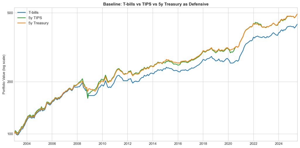
Alternative cash sleeves: I test the original (baseline) strategy with 5-year TIPS and 5-year Treasuries to see whether either reduces the cash drag of sitting in T-bills. This drag becomes especially costly when interest rates are extremely low or when inflation runs high.
What I found:
Faber’s tactical strategy still works exactly as advertised – it’s drawdown insurance, not a return engine.
Two small modifications nearly half the max drawdown when combined.
The startegy is still not cost-free but it’s possible to trade some of that cost for additional risk.
Methodology and Data
Before looking at the results, here is the setup and where my data deviates from Faber’s original paper.
Investing rule and benchmark
The portfolio holds five asset classes in equal weight. At the close of each month, I compare each asset’s price to its own 10-month simple moving average (SMA). If the price is above the average, the asset is held for the following month. If it is below, that 20% allocation moves to cash (represented by 3-month T-bills).
The benchmark for comparison is an equal-weight (EW), buy-and-hold (B&H) portfolio of the same five assets. Both strategies are brought back to target weights at the end of every month.
Asset selection
The original paper used the S&P 500, MSCI EAFE, US 10-Year Treasuries, GSCI Commodities, and NAREIT. Here is my series selection:
Asset Class
Series
US Large Cap
S&P 500 TR Index
Foreign Developed
Fama-French Developed ex-US
US 10-year Treasuries
10-year Treasuries (derived)
Commodities
SP GSCI Commodity TR
Real Estate Investment Trusts
All Equity NAREIT TR
Two data proxies are worth flagging. First, I use Ken French’s Developed ex-US series rather than MSCI EAFE directly. EAFE’s history isn’t freely available before 1997, and French’s data goes back far enough to cover the early nineties. EAFE doesn’t include Canada, but the monthly correlation between the two series over their overlapping period is high enough to be a good substitute.
Second, there is no free, clean total-return index for Treasuries going back this far. Instead, I build one from the 10-year constant-maturity yield using the standard duration approximation:
where is the start-of-month yield, is the change in yield over the month, and is the modified duration of a par bond at the start-of-month yield. I omit the second-order convexity term as it should have a negligible impact.
Backtesting window
The data begins in mid-1990. Since the rule needs ten months of history to compute its first moving average, the strategy goes live in May 1991. It runs through June 2025. That gives us roughly 34 years of history, of which the final 13 are out-of-sample from the original Faber paper.
Does the original strategy still work?
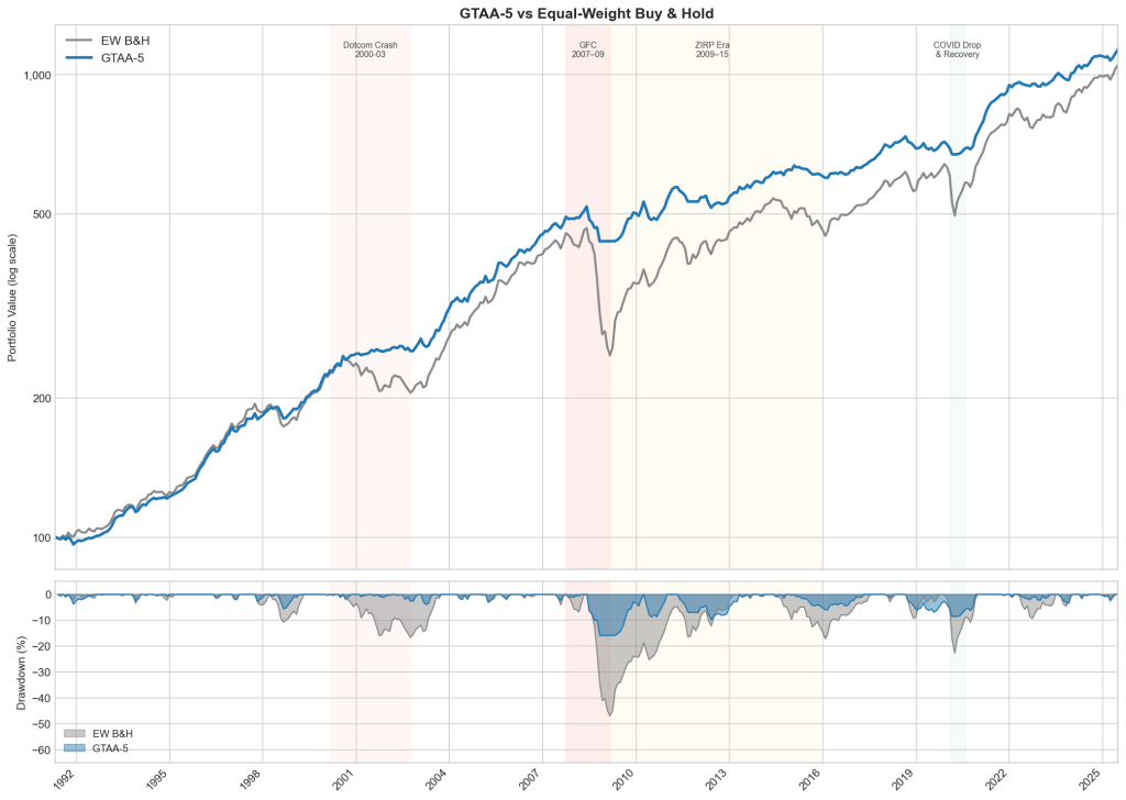
The short answer is yes. As in the original paper, the strategy’s value comes from drawdown reduction, not from raw returns. But looking at the full backtesting window shows how this protection behaves across three very different market regimes.
Prolonged bear markets
The strategy works as intended during slow, structural breakdowns. Up until the Dotcom crash, the baseline strategy and the EW benchmark tracked each other closely. When the bubble burst, the strategy moved to cash and took a shallow drawdown, while the EW portfolio lost 18%.
The gap widened during the Global Financial Crisis (GFC). Because the GFC played out over many months, the moving average had plenty of time to flag the breakdown. The portfolio rotated to cash after the initial hit, taking a 15.8% drawdown against the benchmark’s 46.9% (oooof).
V-shaped liquidity shocks
The COVID crash and recovery was different – remarkable for its speed. It exposes a structural weakness in monthly trend following: path dependency. The violent drop triggered the rule, pushing the portfolio into cash, but a monthly check is too slow to re-engage during a rapid rebound. The strategy successfully avoided the crash but also missed the recovery, allowing the EW portfolio to almost close the gap in the following months.
We can think of the rule as a particular synthetic put that pays off on a fall slower than signal generation frequency.
ZIRP era
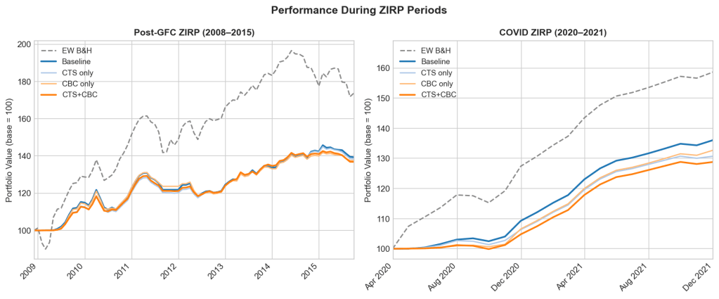
The yellow-shaded area on the chart (2009–2015) is where the strategy suffers most. Underperformance in choppy markets is near-certain, and it’s worst when rates sit near zero.
While the post-GFC bull market roared, the EW portfolio climbed steadily, nearly closing the gap by the second half of 2014. The catch: ZIRP cash drag is terrible right up until an asset-specific shock hits. Late in 2014, commodities entered a brutal bear market with several monthly losses exceeding 10%. The EW portfolio ate those losses in full, along with a sliding developed-market sleeve, while the tactical strategy sat in cash on both. The gap opened up again. So the cash drag was the premium paid and the commodity crash happened to be the payout.
Two modifications
The previous section exposed two weaknesses in the baseline. First, the signal is binary: an asset just above its moving average is treated the same as one 20% above, and the constant flipping around the line generates turnover for no gain. Second, each asset is judged in isolation, as if the five trends were independent. But in a crisis, correlations tend to one and an overlay, scaling the whole portfolio down as more assets break together, can address that. Both changes are small, they leave the original signal and equal-weight philosophy intact.
Continuous Trend Strength (CTS)
CTS changes the question from “Is the price above or below its moving average?” to “How far above or below?” The idea: discount weak signals instead of acting on them at full size.
For each asset I compute a trend score, scaled by 12-month rolling volatility:
then map it to a weight between zero and full allocation:
An asset trading half a vol unit below its average gets zero; a full unit above gets full allocation. Scaling deviations in vol units keeps the score comparable across volatility regimes. I tested a range of cutoffs so the result isn’t an artefact of fine tuning.
Cross-Sectional Breadth Conditioning (CBC)
CBC adds the missing cross-asset view: it counts how many assets are in an uptrend and scales gross exposure accordingly. Faber’s results show the GTAA portfolio holds at least three assets ~80% of the time; CBC targets the other 20%. When a systemic shock hits, assets that diversify well in calm markets fall together. Several breaking in the same month signals that correlations are spiking, and the portfolio leans defensive. The cost is the flip side of the benefit: CBC re-engages more slowly when a single asset rebounds sharply.
Each month I measure breadth as the fraction of assets with a positive trend score, and scale gross exposure by it:
With at least three of five assets trending, the portfolio runs at full size. As breadth falls, exposure throttles down to a 30% floor. The de-risked portion is held in cash.
Are they better than the baseline?
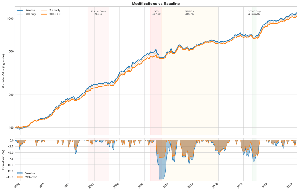
Yesand the gains stack. On their own, each helps: max drawdown falls to −9.6% (CTS) and −11.3% (CBC), and Sharpe rises from 0.87 to 0.95 and 0.92 respectively. Stacked, they do best – drawdown cut almost in half, Sharpe to 0.97. Most of that benefit came during the GFC: in the weights, the combination cuts Dev-ex-US, commodities, and REITs faster than the baseline through mid-2008.
The cost: lower annualised return and higher turnover. A continuous, breadth-scaled signal moves weights more often, so turnover rises. The trade-off is Faber’s original: return in calm markets for protection in bad ones.
Strategy
Ann. Return (%)
Volatility (%)
Sharpe Ratio
Max Drawdown (%)
Turnover
CTS+CBC
7.13
4.65
0.97
-8.4
0.149
CTS only
7.22
4.84
0.95
-9.55
0.144
CBC only
7.28
5.09
0.92
-11.25
0.145
Baseline
7.36
5.48
0.87
-15.87
0.134
The key result is that the combination beats either modification alone. CTS and CBC are catching different things: CTS sharpens the per-asset signal, CBC reads the cross-section.
Is the improvement real or just luck?
To find out, I ran a bootstrap. The question: is the edge CTS+CBC showed in the real backtest genuine, or an artefact of one lucky path through history?
The test resamples six-month blocks of returns with replacement to build 1000 alternative histories. The blocks are sized to preserve the serial correlation that trend-following lives on. For each path I recompute the signals, the portfolio returns, and the Sharpe improvement of CTS+CBC over the baseline, then count how many come out positive.
74% of them do. The distribution leans clearly toward improvement, with a median gain of 0.067 Sharpe. But to call that significant at the usual 5% level you’d want about 95% of paths positive, and 74% doesn’t clear the bar. With only ~34 years of monthly data, the test can’t do much better. The honest claim is that the improvement looks real, but the evidence is suggestive, not conclusive.
Can we fix the cash drag?
Cash drag is the strategy’s biggest structural weakness, and ZIRP is where it does the most damage. The chart isolates the two worst stretches. Over 2009–2015, the EW benchmark ran to nearly 200 before settling around 170, while every strategy variant stalled near 140. The 2020–2021 recovery repeated it: EW reached ~158, the strategies 128–135. When rates are pinned at zero and markets climb or choppy, a cash sleeve earns nothing and the gap compounds.
The modifications don’t touch this. If anything, being more defensive, they hold cash more often, so CTS+CBC drags slightly worse than the baseline in both windows. To attack the drag directly, you have to change the cash leg itself.
So for the final experiment I changed what happens in risk-off mode. Instead of parking de-risked capital in T-bills, I tested two alternatives: 5-year TIPS and 5-year nominal Treasuries. The window starts in late 2003, when FRED’s TIPS series begins – so these figures cover a shorter, more recent period than the full backtest above and aren’t directly comparable to it.
Both lift annualised return over this window, from 6.7% to 7.3%, and the gains land almost entirely in the ZIRP stretches – exactly where the drag was worst. Most remarkably, the return exceeds that of the EW B&H portfolio without paying volatility or drawdown cost. But a bond sleeve isn’t risk free. It carries duration risk: in 2008 Treasuries rallied and cushioned the drawdown, but in 2022 they fell with everything else. Between the two alternatives, nominal 5-year Treasuries beat TIPS – lower volatility (5.7%) and a higher Sharpe (0.988).
Strategy
Ann. Return (%)
Volatility (%)
Sharpe Ratio
Max Drawdown (%)
Baseline with T-bills
6.72
5.87
0.861
-15.9
Baseline with 5Y TIPS
7.36
6.48
0.878
-22.9
Baseline with 5Y Treasuries
7.36
5.72
0.988
-12.9
EW B&H
7.29
10.4
0.576
-46.9
The catch is the sample. 2003–2021 was a bond bull market; measured across it, swapping bills for Treasuries looks like a no-brainer but it isn’t. It trades a known, constant drag for a regime-dependent one, and 2022 is the regime that punishes it.