For the inaugural post of this blog, I wanted to start at the foundation. I chose Meb Faber’s A Quantitative Approach to Tactical Asset Allocation (2013 version) because it offers a simple, mechanical tactical asset allocation model based entirely on asset prices. So before plunging into factor exposures, macro regimes, and portfolio optimization techniques, it’s important to establish an effective baseline.
The Faber’s strategy is asset-agnostic and can be applied to any number of constituents. Each asset generates its own investing signal: hold the asset while its price is above its 10-month moving average or invest the asset’s allocation into T-bills when it falls below. The idea is that the long moving average filters out short-term noise and flags the regime shifts that precede large drawdowns.
The original five-asset portfolio delivered equity-like returns with materially lower volatility and drawdowns than a standard buy-and-hold. But Faber’s results ran only through 2012. We now have over a decade of fresh, out-of-sample data. That window includes the 2020 COVID crash and, more importantly, the 2022 inflation shock – the kind of regime we hadn’t seen in decades.
In this post, I revisit the strategy with three goals:
- The full sample test: I run the original strategy on data through 2025 to see if the baseline rules still work.
- Signal modifications: The original system is strictly binary. I propose and test two modifications that trade some simplicity for a more continuous (1) and cross-sectional (2) signals, aiming to smooth out the rigid on/off nature of the original rule.
- Alternative cash sleeves: I test the original (baseline) strategy with 5-year TIPS and 5-year Treasuries to see whether either reduces the cash drag of sitting in T-bills. This drag becomes especially costly when interest rates are extremely low or when inflation runs high.
What I found:
- Faber’s tactical strategy still works exactly as advertised – it’s drawdown insurance, not a return engine.
- Two small modifications nearly half the max drawdown when combined.
- The startegy is still not cost-free but it’s possible to trade some of that cost for additional risk.
Methodology and Data
Before looking at the results, here is the setup and where my data deviates from Faber’s original paper.
Investing rule and benchmark
The portfolio holds five asset classes in equal weight. At the close of each month, I compare each asset’s price to its own 10-month simple moving average (SMA). If the price is above the average, the asset is held for the following month. If it is below, that 20% allocation moves to cash (represented by 3-month T-bills).
The benchmark for comparison is an equal-weight (EW), buy-and-hold (B&H) portfolio of the same five assets. Both strategies are brought back to target weights at the end of every month.
Asset selection
The original paper used the S&P 500, MSCI EAFE, US 10-Year Treasuries, GSCI Commodities, and NAREIT. Here is my series selection:
| Asset Class | Series |
|---|---|
| US Large Cap | S&P 500 TR Index |
| Foreign Developed | Fama-French Developed ex-US |
| US 10-year Treasuries | 10-year Treasuries (derived) |
| Commodities | SP GSCI Commodity TR |
| Real Estate Investment Trusts | All Equity NAREIT TR |
Two data proxies are worth flagging. First, I use Ken French’s Developed ex-US series rather than MSCI EAFE directly. EAFE’s history isn’t freely available before 1997, and French’s data goes back far enough to cover the early nineties. EAFE doesn’t include Canada, but the monthly correlation between the two series over their overlapping period is high enough to be a good substitute.
Second, there is no free, clean total-return index for Treasuries going back this far. Instead, I build one from the 10-year constant-maturity yield using the standard duration approximation:
where is the start-of-month yield, is the change in yield over the month, and is the modified duration of a par bond at the start-of-month yield. I omit the second-order convexity term as it should have a negligible impact.
Backtesting window
The data begins in mid-1990. Since the rule needs ten months of history to compute its first moving average, the strategy goes live in May 1991. It runs through June 2025. That gives us roughly 34 years of history, of which the final 13 are out-of-sample from the original Faber paper.
Does the original strategy still work?
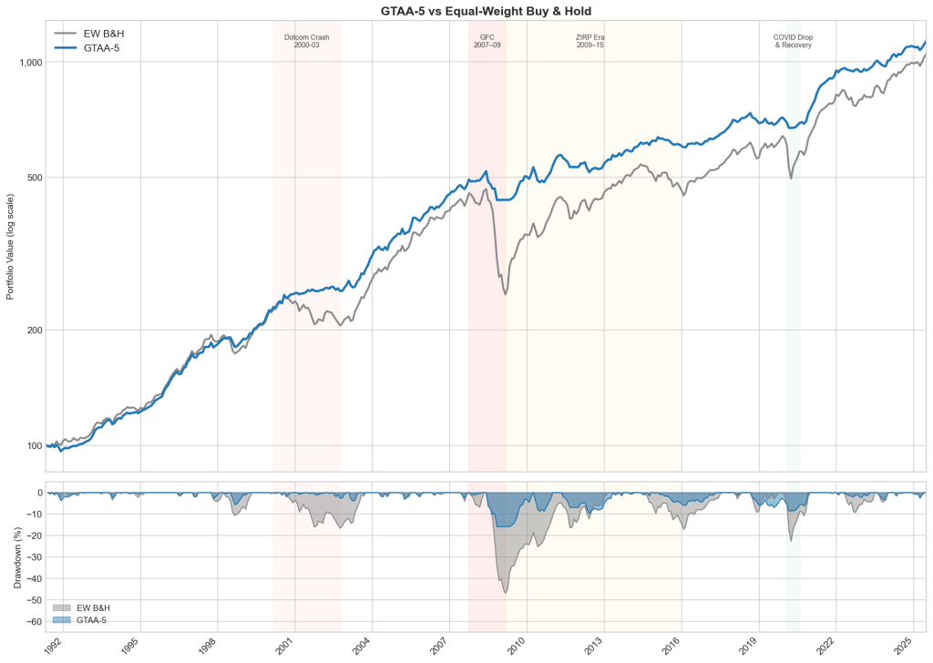
The short answer is yes. As in the original paper, the strategy’s value comes from drawdown reduction, not from raw returns. But looking at the full backtesting window shows how this protection behaves across three very different market regimes.
Prolonged bear markets
The strategy works as intended during slow, structural breakdowns. Up until the Dotcom crash, the baseline strategy and the EW benchmark tracked each other closely. When the bubble burst, the strategy moved to cash and took a shallow drawdown, while the EW portfolio lost 18%.
The gap widened during the Global Financial Crisis (GFC). Because the GFC played out over many months, the moving average had plenty of time to flag the breakdown. The portfolio rotated to cash after the initial hit, taking a 15.8% drawdown against the benchmark’s 46.9% (oooof).
V-shaped liquidity shocks
The COVID crash and recovery was different – remarkable for its speed. It exposes a structural weakness in monthly trend following: path dependency. The violent drop triggered the rule, pushing the portfolio into cash, but a monthly check is too slow to re-engage during a rapid rebound. The strategy successfully avoided the crash but also missed the recovery, allowing the EW portfolio to almost close the gap in the following months.
We can think of the rule as a particular synthetic put that pays off on a fall slower than signal generation frequency.
ZIRP era
The yellow-shaded area on the chart (2009–2015) is where the strategy suffers most. Underperformance in choppy markets is near-certain, and it’s worst when rates sit near zero.
While the post-GFC bull market roared, the EW portfolio climbed steadily, nearly closing the gap by the second half of 2014. The catch: ZIRP cash drag is terrible right up until an asset-specific shock hits. Late in 2014, commodities entered a brutal bear market with several monthly losses exceeding 10%. The EW portfolio ate those losses in full, along with a sliding developed-market sleeve, while the tactical strategy sat in cash on both. The gap opened up again. So the cash drag was the premium paid and the commodity crash happened to be the payout.
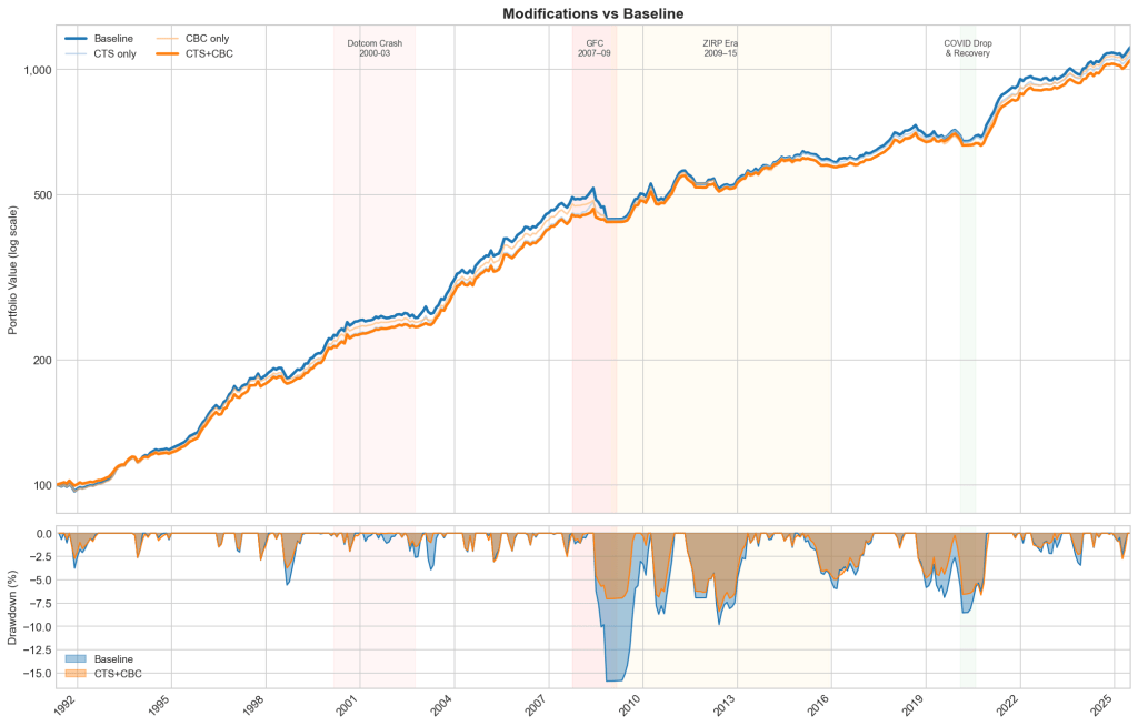
Two modifications
The previous section exposed two weaknesses in the baseline. First, the signal is binary: an asset just above its moving average is treated the same as one 20% above, and the constant flipping around the line generates turnover for no gain. Second, each asset is judged in isolation, as if the five trends were independent. But in a crisis, correlations tend to one and an overlay, scaling the whole portfolio down as more assets break together, can address that. Both changes are small, they leave the original signal and equal-weight philosophy intact.
Continuous Trend Strength (CTS)
CTS changes the question from “Is the price above or below its moving average?” to “How far above or below?” The idea: discount weak signals instead of acting on them at full size.
For each asset I compute a trend score, scaled by 12-month rolling volatility:
then map it to a weight between zero and full allocation:
An asset trading half a vol unit below its average gets zero; a full unit above gets full allocation. Scaling deviations in vol units keeps the score comparable across volatility regimes. I tested a range of cutoffs so the result isn’t an artefact of fine tuning.
Cross-Sectional Breadth Conditioning (CBC)
CBC adds the missing cross-asset view: it counts how many assets are in an uptrend and scales gross exposure accordingly. Faber’s results show the GTAA portfolio holds at least three assets ~80% of the time; CBC targets the other 20%. When a systemic shock hits, assets that diversify well in calm markets fall together. Several breaking in the same month signals that correlations are spiking, and the portfolio leans defensive. The cost is the flip side of the benefit: CBC re-engages more slowly when a single asset rebounds sharply.
Each month I measure breadth as the fraction of assets with a positive trend score, and scale gross exposure by it:
With at least three of five assets trending, the portfolio runs at full size. As breadth falls, exposure throttles down to a 30% floor. The de-risked portion is held in cash.
Are they better than the baseline?
Yes and the gains stack. On their own, each helps: max drawdown falls to −9.6% (CTS) and −11.3% (CBC), and Sharpe rises from 0.87 to 0.95 and 0.92 respectively. Stacked, they do best – drawdown cut almost in half, Sharpe to 0.97. Most of that benefit came during the GFC: in the weights, the combination cuts Dev-ex-US, commodities, and REITs faster than the baseline through mid-2008.
The cost: lower annualised return and higher turnover. A continuous, breadth-scaled signal moves weights more often, so turnover rises. The trade-off is Faber’s original: return in calm markets for protection in bad ones.
| Strategy | Ann. Return (%) | Volatility (%) | Sharpe Ratio | Max Drawdown (%) | Turnover |
|---|---|---|---|---|---|
| CTS+CBC | 7.13 | 4.65 | 0.97 | -8.4 | 0.149 |
| CTS only | 7.22 | 4.84 | 0.95 | -9.55 | 0.144 |
| CBC only | 7.28 | 5.09 | 0.92 | -11.25 | 0.145 |
| Baseline | 7.36 | 5.48 | 0.87 | -15.87 | 0.134 |
The key result is that the combination beats either modification alone. CTS and CBC are catching different things: CTS sharpens the per-asset signal, CBC reads the cross-section.
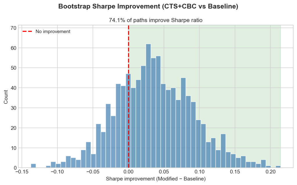
Is the improvement real or just luck?
To find out, I ran a bootstrap. The question: is the edge CTS+CBC showed in the real backtest genuine, or an artefact of one lucky path through history?
The test resamples six-month blocks of returns with replacement to build 1000 alternative histories. The blocks are sized to preserve the serial correlation that trend-following lives on. For each path I recompute the signals, the portfolio returns, and the Sharpe improvement of CTS+CBC over the baseline, then count how many come out positive.
74% of them do. The distribution leans clearly toward improvement, with a median gain of 0.067 Sharpe. But to call that significant at the usual 5% level you’d want about 95% of paths positive, and 74% doesn’t clear the bar. With only ~34 years of monthly data, the test can’t do much better. The honest claim is that the improvement looks real, but the evidence is suggestive, not conclusive.
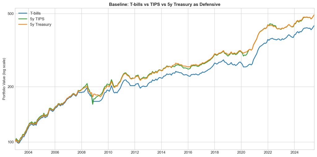
Can we fix the cash drag?
Cash drag is the strategy’s biggest structural weakness, and ZIRP is where it does the most damage. The chart isolates the two worst stretches. Over 2009–2015, the EW benchmark ran to nearly 200 before settling around 170, while every strategy variant stalled near 140. The 2020–2021 recovery repeated it: EW reached ~158, the strategies 128–135. When rates are pinned at zero and markets climb or choppy, a cash sleeve earns nothing and the gap compounds.
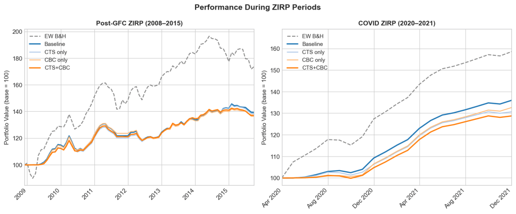
The modifications don’t touch this. If anything, being more defensive, they hold cash more often, so CTS+CBC drags slightly worse than the baseline in both windows. To attack the drag directly, you have to change the cash leg itself.
So for the final experiment I changed what happens in risk-off mode. Instead of parking de-risked capital in T-bills, I tested two alternatives: 5-year TIPS and 5-year nominal Treasuries. The window starts in late 2003, when FRED’s TIPS series begins – so these figures cover a shorter, more recent period than the full backtest above and aren’t directly comparable to it.
Both lift annualised return over this window, from 6.7% to 7.3%, and the gains land almost entirely in the ZIRP stretches – exactly where the drag was worst. Most remarkably, the return exceeds that of the EW B&H portfolio without paying volatility or drawdown cost. But a bond sleeve isn’t risk free. It carries duration risk: in 2008 Treasuries rallied and cushioned the drawdown, but in 2022 they fell with everything else. Between the two alternatives, nominal 5-year Treasuries beat TIPS – lower volatility (5.7%) and a higher Sharpe (0.988).
| Strategy | Ann. Return (%) | Volatility (%) | Sharpe Ratio | Max Drawdown (%) |
|---|---|---|---|---|
| Baseline with T-bills | 6.72 | 5.87 | 0.861 | -15.9 |
| Baseline with 5Y TIPS | 7.36 | 6.48 | 0.878 | -22.9 |
| Baseline with 5Y Treasuries | 7.36 | 5.72 | 0.988 | -12.9 |
| EW B&H | 7.29 | 10.4 | 0.576 | -46.9 |
The catch is the sample. 2003–2021 was a bond bull market; measured across it, swapping bills for Treasuries looks like a no-brainer but it isn’t. It trades a known, constant drag for a regime-dependent one, and 2022 is the regime that punishes it.

Leave a comment